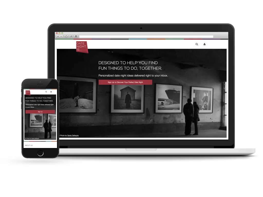
Date Night Is...
The Project: Product
Come back soon to read my case study about founding, launching and iterating on Date Night Is... with my co-founder, Danny Nathan. And in the meantime, you can read his write-up here.
Come back soon to read my case study about founding, launching and iterating on Date Night Is... with my co-founder, Danny Nathan. And in the meantime, you can read his write-up here.

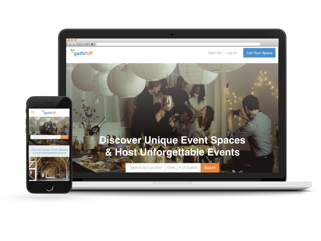
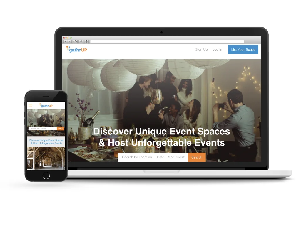
GathrUp is an early stage startup whose aim is to help event planners find unique event spaces for smaller gatherings by connecting them with private property owners who are interested in renting out their space — an AirBnB for events.
The CEO, Joshua Porter, challenged us to design the MVP for GathrUp that would help engender trust among early users and foster connections between the event planner and space owner. We aimed to carefully refine the MVP to the most essential functionality for communication between these two, while leaving the design flexible enough to work with a robust marketing plan to foster excitement around the new brand.
It was important for Joshua to create a feeling of excitement about coming together, and to gain a clear understanding of his potential users’ needs and motivations, so we started the process by diving into user research.
Joni Goldbach: User Research, Event Planner-side Design (UX/UI) & Testing, User Profile and Account Design
Enzo Antonio: Competitive Research, Space Owner-side Design & Testing
3 weeks
We took a broad approach to learning who the GathrUp audience by reaching out to people with a variety of experiences in personal and professional event planning, and renting out their space for events and through P2P rental services.
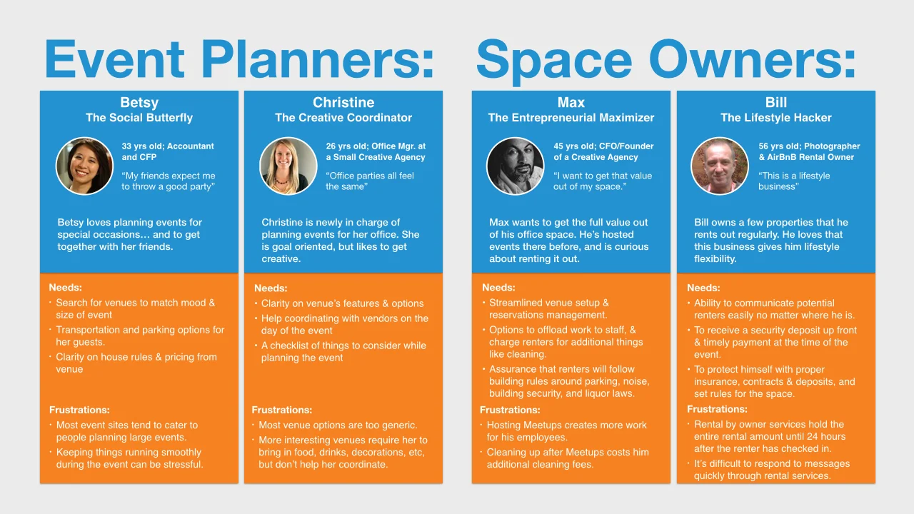
And through our interviews, we were able to develop four primary user personas, and uncover an underlying tension in the interaction between space owner and event planners looking to rent out a space. Resolving the tension between event planner wishes and space owner comfort levels in a way that would fill the needs of our personas drove our decision-making in designing the GathrUp experience.
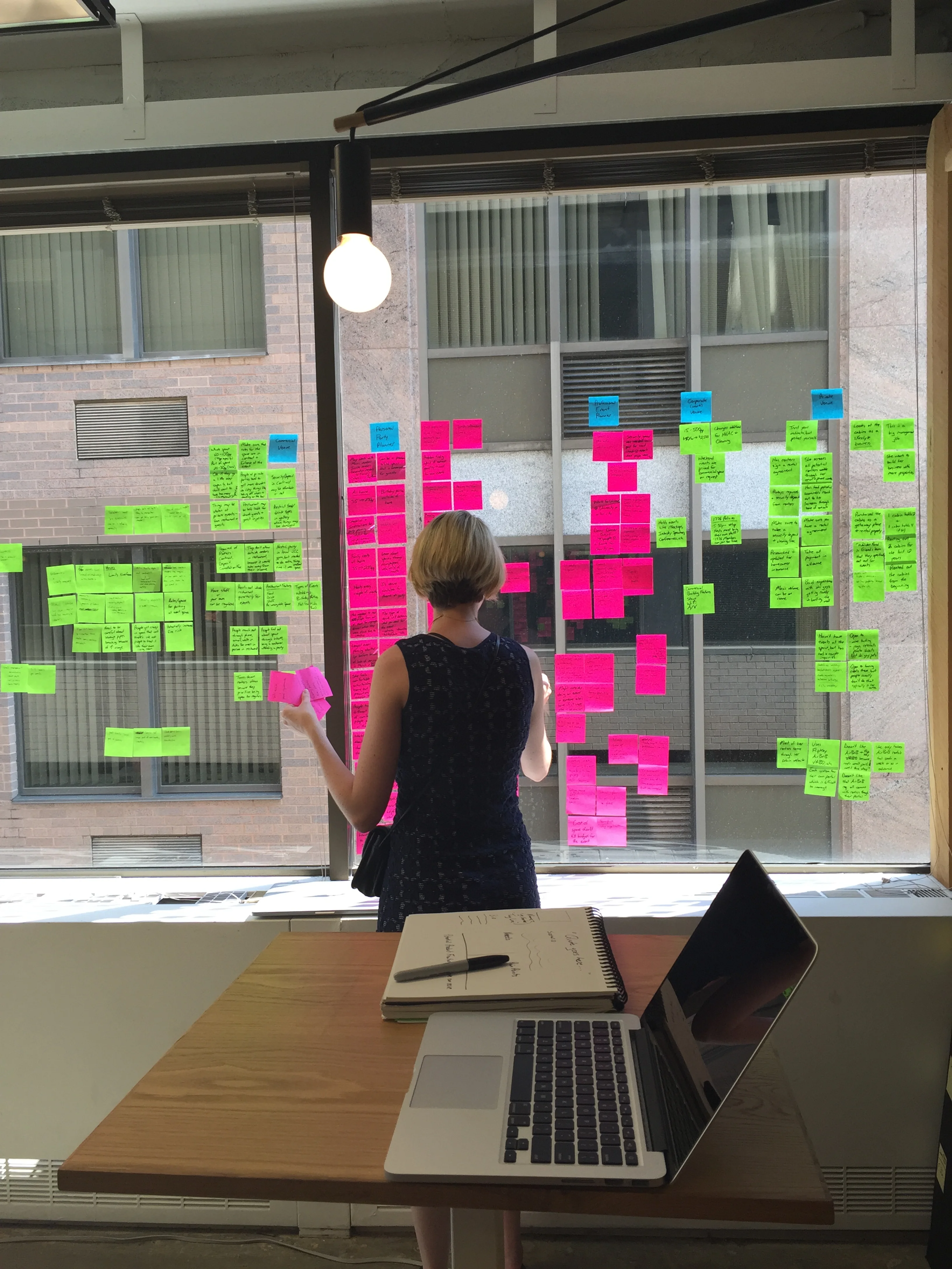
After interviewing 10 event planners and space owners, I created a map of key points from our conversations to organize common themes and goals for each group.

We met with Joshua to review our findings from research, and confirm how GathrUp could fulfill user needs.

We found that event planners are concerned with finding a space that would create the right type of atmosphere for the event, and would be comfortable for their guests. Space owners wanted to be sure they and their space were protected during the event, and then were willing to do whatever was needed for the event to go on without a hitch.
Both sides were open to the idea of renting out privately owned space for events, but only certain types of spaces, and only for certain types of events.

Context is important, but each person had different ideas about what events are appropriate in their space… and changed their opinion based on their role as an event planner, or space owner.

People tend to trust themselves more in the role of event planner, but each person drew a different line around activities they felt comfortable with having someone host in their space including drinking, cooking, serving messy foods, inviting people the host didn’t know well, or inviting children. This realization, and the need to resolve this discrepancy became a primary focus in designing the GathrUp experience.
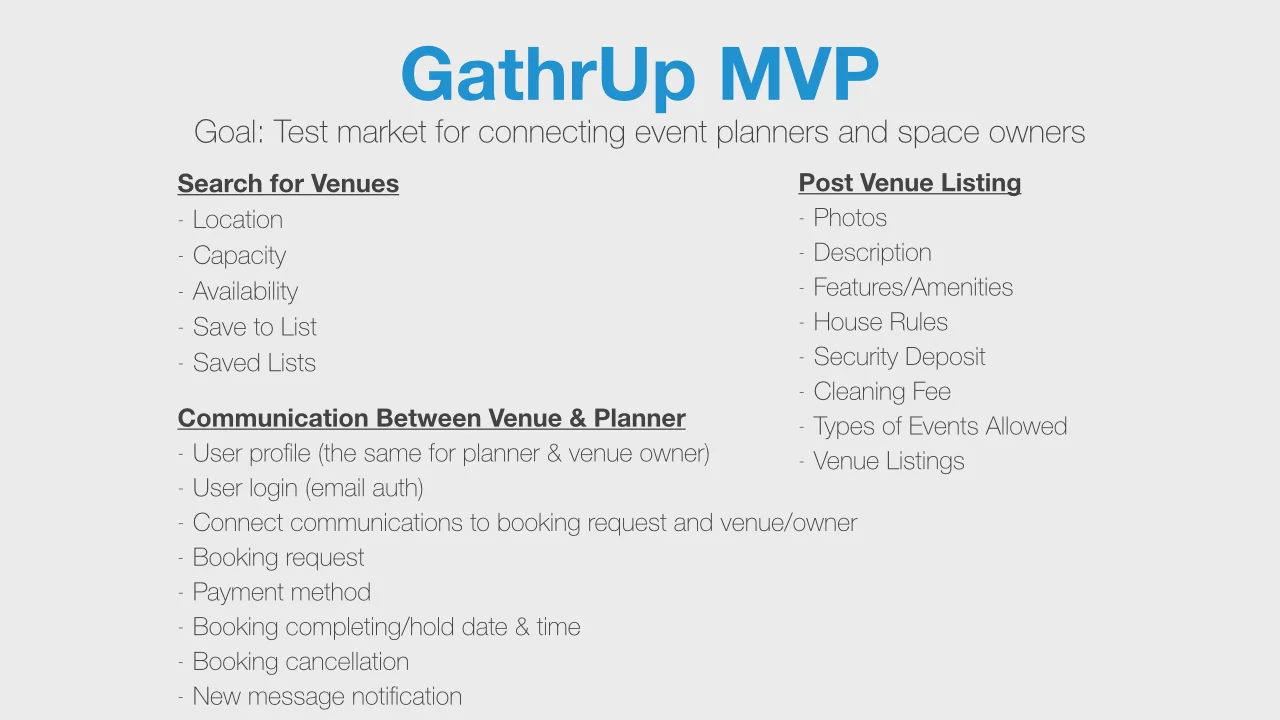
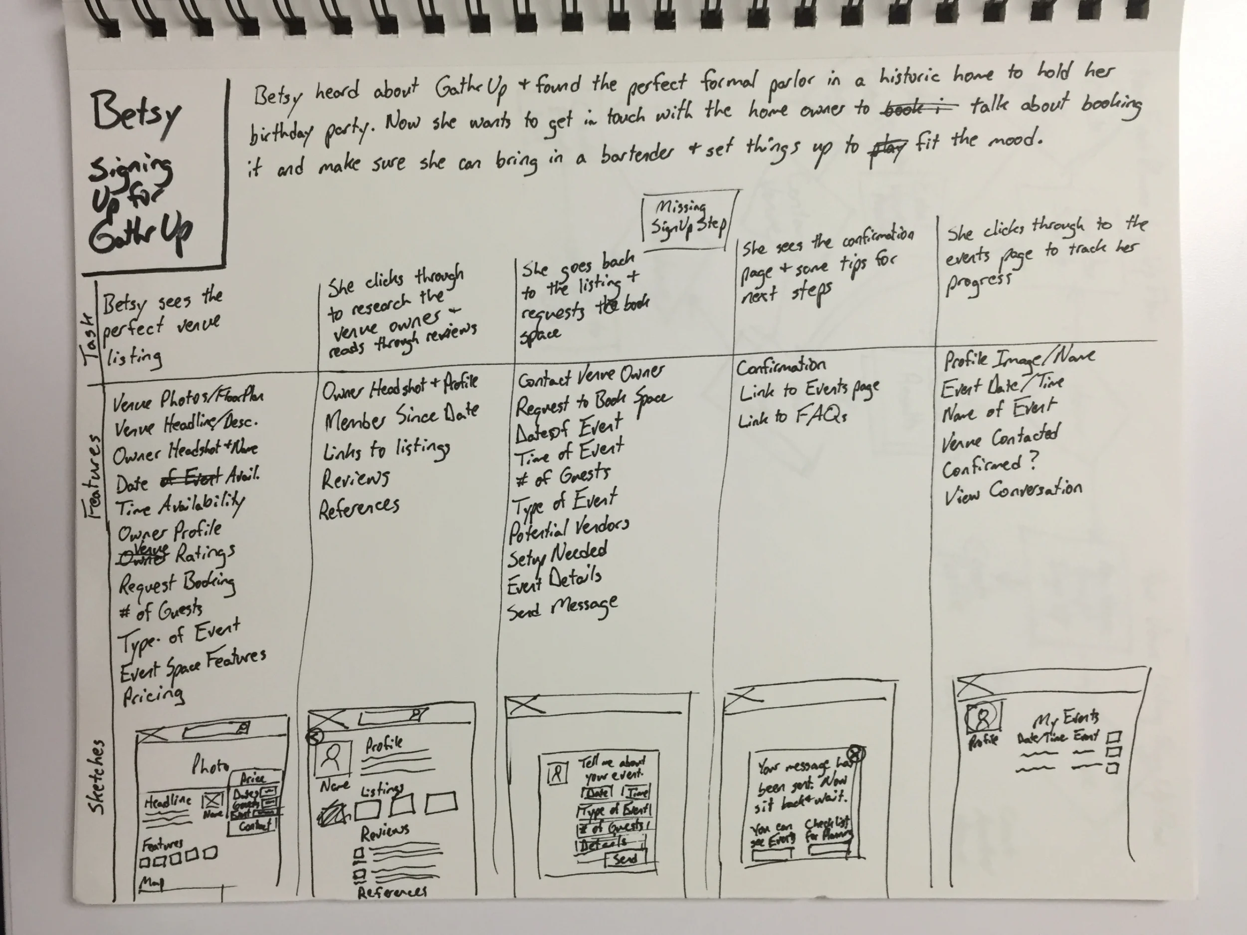
With an overview of user needs in mind, I set out to define the minimum viable feature set for a web and mobile ready experience that would facilitate connections between event planners and space owners to rent out their space.
Focusing down to the most necessary features to test out the MVP was a purposeful decision to get GathrUp to market quickly and allow flexibility to change & add features as Joshua gets early user feedback.
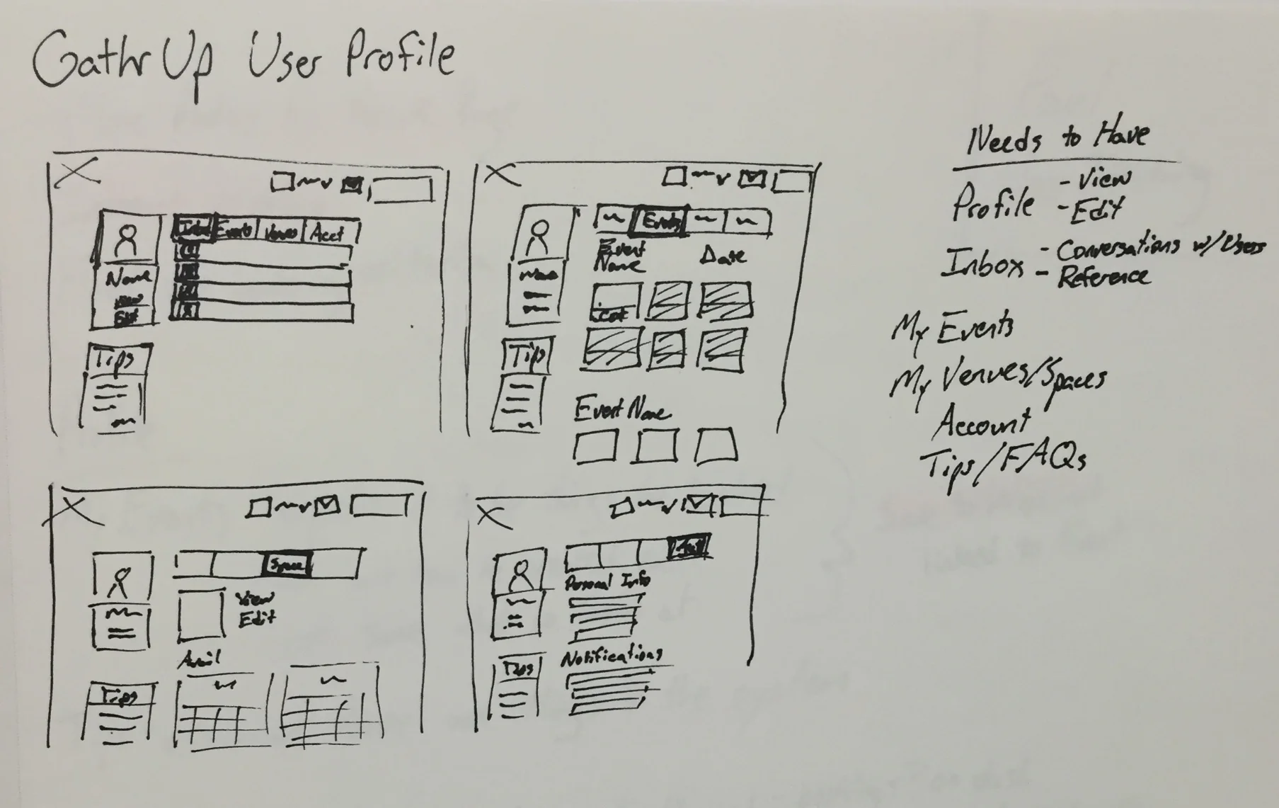
From there, we started sketching out the primary interaction for the GathrUp MVP — searching for a venue and the interaction between planner and venue owner. Then, we broke out parts of the experience to own for the remainder of the project. I focused on the event planner side of the experience, plus user profiles and account dashboards. Enzo focused on the venue owner listing experience and venue management dashboard.
For this project, it was helpful for me to write out features needed as I sketched out user flows to keep sketches grounded in the total feature set needed to accomplish the task.

Overall response in user testing was positive. Users responded well to the images and understood what the site was meant to accomplish, but the images of spaces alone weren’t working hard enough to capture the excitement of being at a great event. So, I replaced the header with an image that more closely represented that feeling, and integrated photos of past events along with featured spaces in a carousel at the bottom of the page.
Number of guests was initially a range of numbers to help with speed in search, but I changed that to a type in field to help with venue planning later in the process.

I started with a fairly minimal search results page for user testing, which was useful for pulling out the pieces of information that were most important at this stage in the search process. Users noted that they wanted to easily connect price, location, images, and a title.
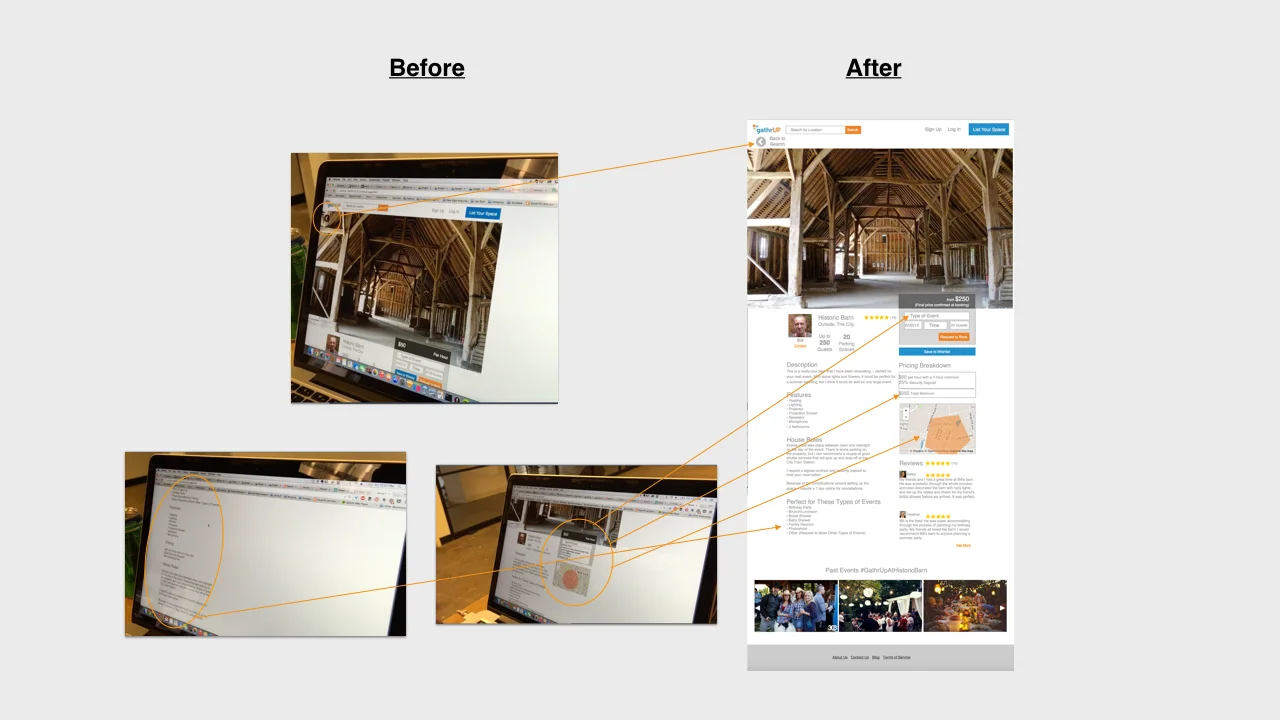
On the venue page, I similarly started out with a simplistic list of information about the space. There is so much information that event planners and venue owners expect to use that I wanted to use user testing as a place to optimize the layout and prioritize the most important pieces.
Pricing and a couple of space features like occupancy and parking stood out as most important to see at a glance, so I highlighted and pulled them to the top of the page along with a map view of the location of the venue.
After talking through opportunities for engendering more excitement around the venue and event experience with Joshua, I incorporated a carousel of images at the bottom of the page that would be pulled in from Instagram through a unique hashtag identifier for the venue, and carved out a space on the page for verbatim reviews.

The initial sign in flow after indicating a request to book echoed the flow that AirBnB currently uses, but users found the lack of indication that this was a necessary step to book confusing. I took that into consideration in the revised flow with a little additional messaging to clarify.
During the booking process, I envisioned the search and booking criteria being pulled through, so that the user would just need to add a personal note with a little additional information about the event for the vendor before completing the booking.
I created a confirmation message which the user would see after completing booking aimed to instill confidence, but encourage the user to keep browsing through other locations in case the first location doesn’t work out.
We each worked on our sections of the GathrUp site design, comparing notes along the way through the few days we had to prototype and test.
My designs for the event planner experience, user profiles, and account section were influenced by similar products like AirBnB, SpareChair and similar space rental services, but I aimed to limit the product to features that would advance the goal of the MVP and support product launch.
User testing helped me identify and highlight the most important pieces of information for event planners as they were searching for and booking an event space, and helped test brand imagery and marketing moments in the product experience.
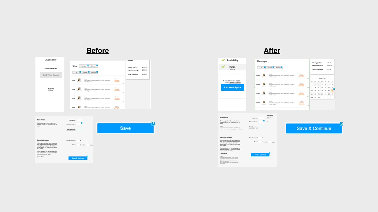
The part of the prototype shown below demonstrates the most important user flow in the GathrUp MVP experience -- the interaction between an event planner and a property owner renting out their space.
Because GathrUp is about encouraging people to get together in person more often, the user experience can't be limited to just a web and mobile interface. Beyond booking the perfect space for an event, ensuring that the event itself went smoothly was important for both event planners and space owners. And further, as Joshua is building the GathrUp brand, it was important for him to ensure that every touchpoint convey trustworthiness.
We spoke with Joshua about potential hurdles and marketing strategies to foster community support and create a great end-to-end user experience. And to wrap up the project, I created an early-stage marketing strategy, an outline of legal considerations, a brief checklist for product launch and an outline of tactics that we discussed for the future beyond the MVP.

Though we incorporated opportunities in the product for event planners and space owners to talk about and resolve any discrepancies in the types of events they feel comfortable with, we felt that would not be enough to relieve any discomfort people might have with renting out their space for events, particularly with AirBnB vandalization stories making national news.
Bad things happen, and at bars, restaurants, and other professionally run events, staff help keep things under control and make sure everyone has a great time. We proposed that GathrUp do the same by enlisting Brand Ambassadors to act as Day-of Planners and representatives of the brand.

I outlined marketing tactics that would help Joshua bring the GathrUp brand to life. Together, they create a cohesive strategy to reinforce the relationships between event planners and space owners, between GathrUp and the community.

Learning from the struggles of similar businesses like AirBnB and from our conversations with people who rent out their spaces, I created a list of legal considerations that could be important for GathrUp early on.


Joshua was thrilled with the designs we created through this engagement, and is currently working with a developer to bring GathrUp to life. Enzo and I are both look forward to seeing GathrUp come to life!
USA Today and General Assembly joined forces for a hackathon with the goal of creating new concepts for USA Today digital properties. UX designers were teamed with groups of Web Development students and given 5 days to go from concept to live product demo.
Joni Goldbach: User Experience Design
Jocelyn Jeriah: HTML/CSS Development
Nick Bumbarger: Geo-Spacial Development
Toby Schaeffer: Back End Development
5 days

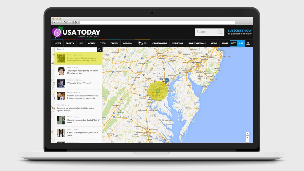
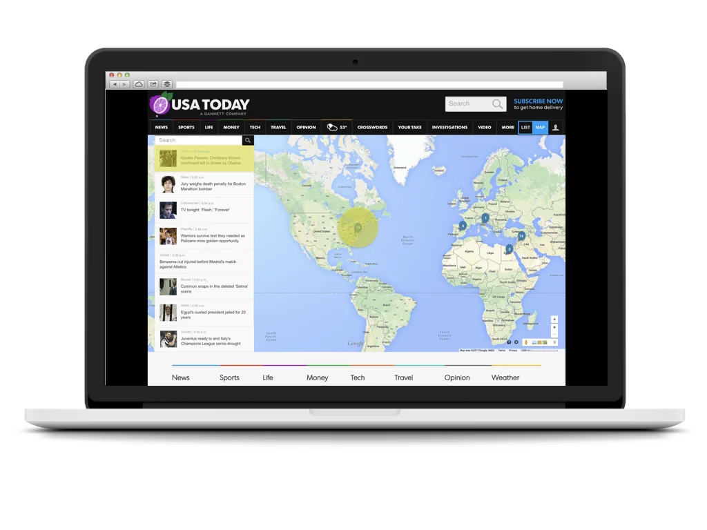
The USA Today team challenged us to create a digital product that would help engage their readers on USAToday.com. With such a wide scope of possibilities, our team found a little time with a few of the folks from USA Today to ask them a little more about some problems they wanted to explore further. One that stood out was an interest in utilizing maps as an interface for engaging with the news. With team members with a strong interest and background in mapping, we decided to give it a go, starting our journey with a team design studio session and landing on a plan to create an alternate way to explore the news through a map interface.
As the UX designer on the team, I began user research while my teammates researched news and mapping APIs. I found a couple of avid news readers at General Assembly who were willing to share their experiences with me. From my conversations with these folks, I developed two distinct personas that helped inform the design for our initial prototype -- Kat who prioritizes news that affects her personally, and Allison who wants to be sure she isn't missing any big historic events, and wants the flexibility to see the news when and how she likes.
After regrouping and sharing with my teammates, I created a paper prototype with desktop and mobile representations. We had decided to move forward with a prototype that would utilize the Mapbox and USAToday APIs, so I incorporated the current USAToday content categories (Right Now, Top Stories, Most Popular, and Trending on Social) into the prototype to start testing the types of content readers would be interested in interacting with in the context of a map.
The results were fascinating. When shown a map with news stories represented as pinpoints alongside a feed of news headlines, the first thing each tester did was tap the map, expecting the area to expand so they could explore news stories happening in that area. While interacting with the map, they focused on places of personal importance, and expected new, important stories be highlighted on the map as they happened, looking to the news stream to filter for headlines of top stories. Given the option to see each of the four current content categories, our testers gravitated towards Right Now and Top Stories and away from Most Popular and Trending on Social -- a trend that was later confirmed by the USA Today team. Interestingly, when presented with a mobile version, our testers found it too cumbersome to interact with a map and preferred text and image based interfaces when catching up on news on their phone, even when location was an important factor.
Taking what I had learned from research and testing into account, the design for our USA Today map view would allow users an alternate way to explore the news on USAToday.com in desktop by switching from the standard view to a "map view" with a feed that would prioritize Top Stories with a clear location and automatically update as new stories come in, highlighting them on the map and the feed. To help users keep an eye on the news they are most interested in, users would be able to log in, search for and save locations, articles and topics of interest, and mark them as read to remove them from their personal feed.
Of course, with only a few days to build, Toby and I got together to write out our user stories and prioritize the ones we would need to test out our basic assumption -- that readers would interact with a map interface to explore the news. We narrowed down to 5 user stories for our sprint through the rest of the week, and put the rest on a roadmap for the future. However, as we came to the end of the week, Toby, Nick and Jocelyn were able to complete a couple of the user stories that we had saved for later, sorting articles by news desk onto individual maps and creating user authentication by email.
By the end of the week, we were excited to share our prototype with the USA Today team, and have had the opportunity to share with a couple of their other team members since then.
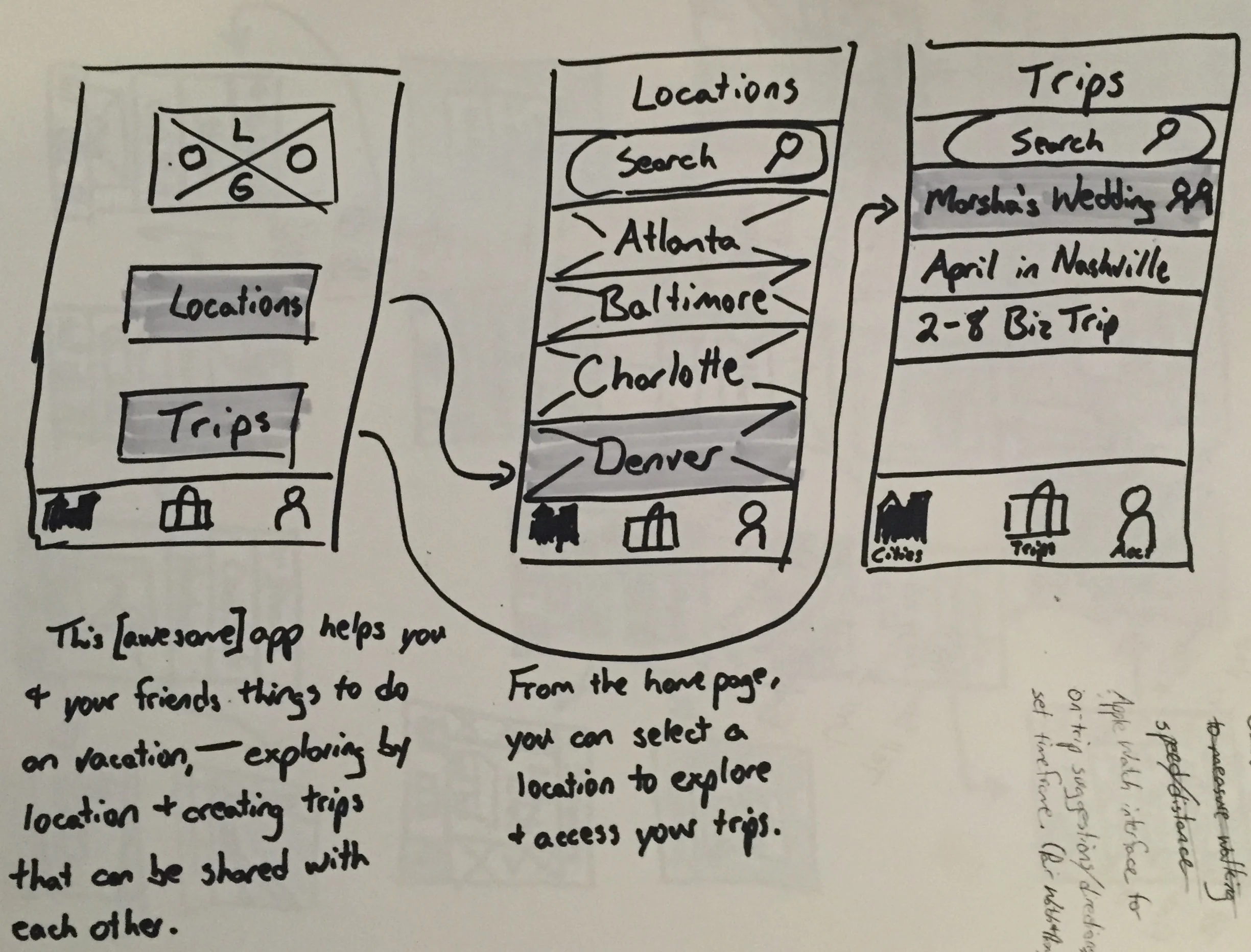
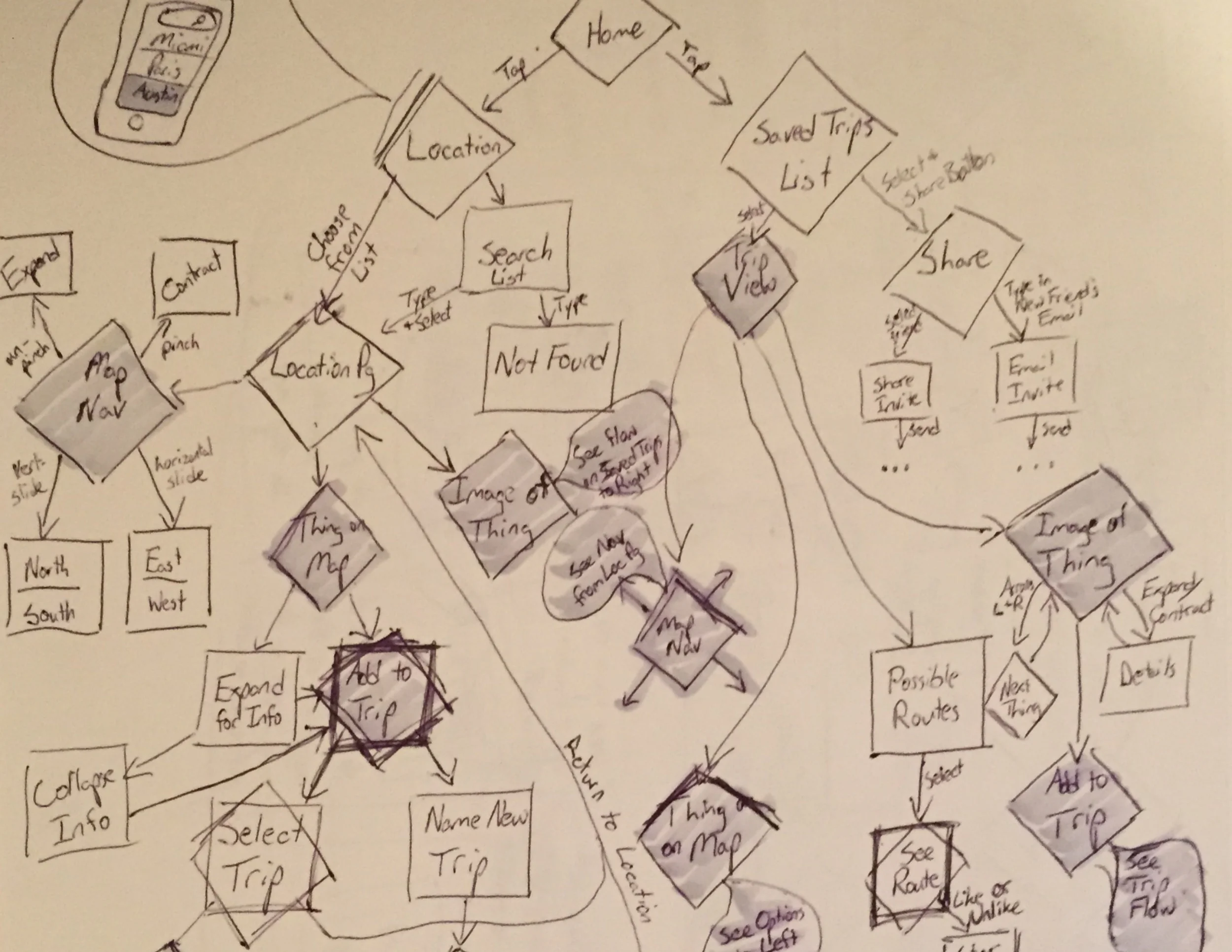
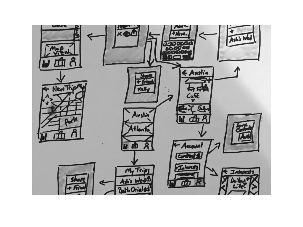
This was the first project from my UX Design Intensive class at General Assembly. We worked individually through user research, sketching and prototyping on an assigned topic to design a mobile app with the surprise addition of an Apple Watch component in anticipation of the upcoming Apple Watch release.
5 days
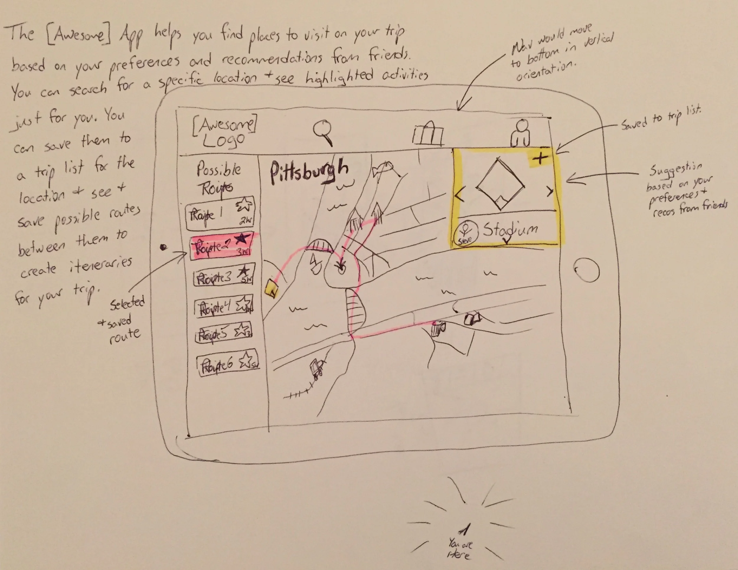
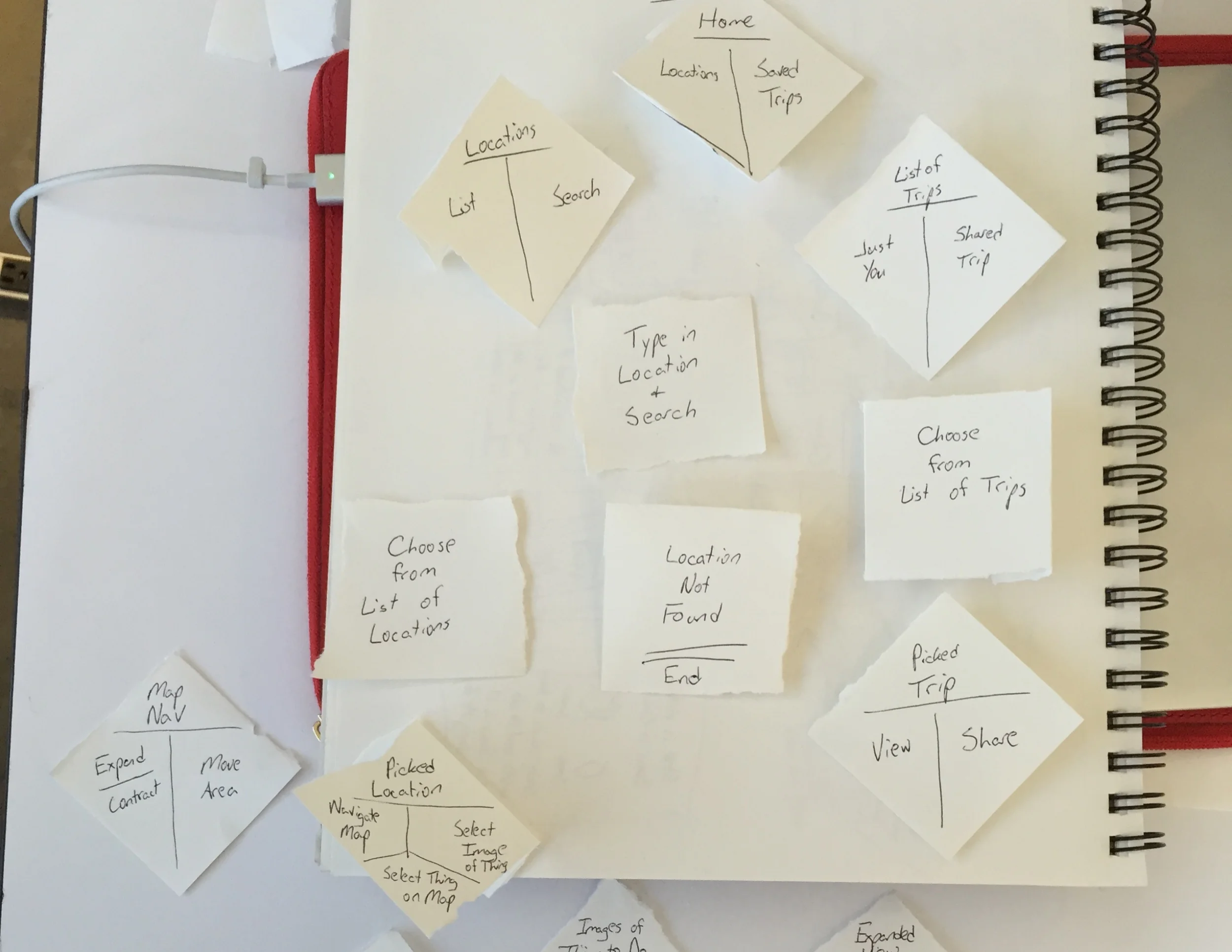
When our users travel, they know where they are going, they know who they will be spending time with, but they don’t know what to do when they have time to kill. The current solutions give recommendations that are unreliable, or don’t fit their preferences.
Create a new mobile app that makes traveling as much fun as planning your vacation!
DISCOVERED is an app that travelers can use to:
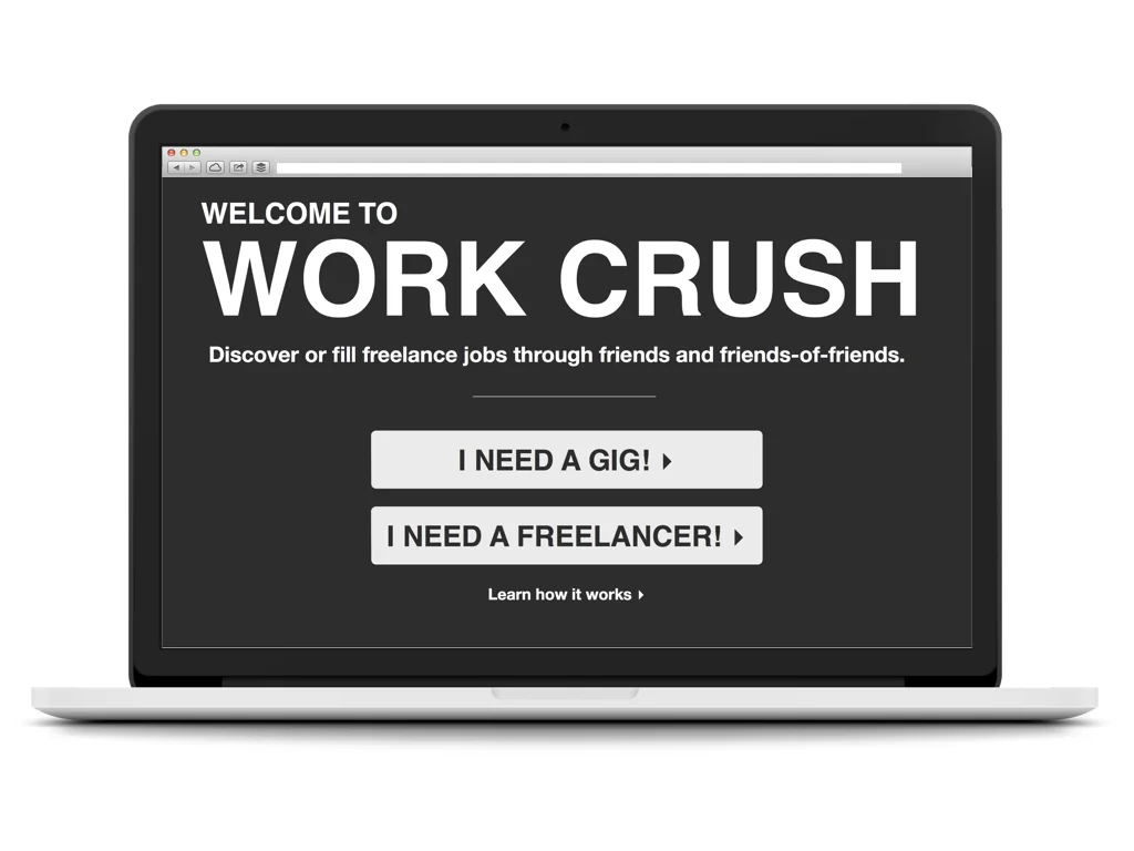
Work Crush is a conceptual product created for my Product Management class at General Assembly.