USA Today Map View
The Project: UX
USA Today and General Assembly joined forces for a hackathon with the goal of creating new concepts for USA Today digital properties. UX designers were teamed with groups of Web Development students and given 5 days to go from concept to live product demo.
The Team:
Joni Goldbach: User Experience Design
Jocelyn Jeriah: HTML/CSS Development
Nick Bumbarger: Geo-Spacial Development
Toby Schaeffer: Back End Development
Skills Used:
- Design Studio
- User Interviews
- Rapid Prototyping
- User Personas
- Sketching
- User Flows
- Wireframing
- Visual Design
- Feature Definition and Prioritization
- User Testing
Length of Engagement:
5 days


Where We Started:
The USA Today team challenged us to create a digital product that would help engage their readers on USAToday.com. With such a wide scope of possibilities, our team found a little time with a few of the folks from USA Today to ask them a little more about some problems they wanted to explore further. One that stood out was an interest in utilizing maps as an interface for engaging with the news. With team members with a strong interest and background in mapping, we decided to give it a go, starting our journey with a team design studio session and landing on a plan to create an alternate way to explore the news through a map interface.
Connecting with Readers:


As the UX designer on the team, I began user research while my teammates researched news and mapping APIs. I found a couple of avid news readers at General Assembly who were willing to share their experiences with me. From my conversations with these folks, I developed two distinct personas that helped inform the design for our initial prototype -- Kat who prioritizes news that affects her personally, and Allison who wants to be sure she isn't missing any big historic events, and wants the flexibility to see the news when and how she likes.
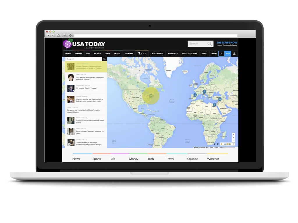
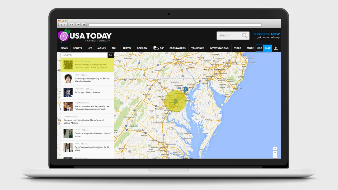
After regrouping and sharing with my teammates, I created a paper prototype with desktop and mobile representations. We had decided to move forward with a prototype that would utilize the Mapbox and USAToday APIs, so I incorporated the current USAToday content categories (Right Now, Top Stories, Most Popular, and Trending on Social) into the prototype to start testing the types of content readers would be interested in interacting with in the context of a map.
The results were fascinating. When shown a map with news stories represented as pinpoints alongside a feed of news headlines, the first thing each tester did was tap the map, expecting the area to expand so they could explore news stories happening in that area. While interacting with the map, they focused on places of personal importance, and expected new, important stories be highlighted on the map as they happened, looking to the news stream to filter for headlines of top stories. Given the option to see each of the four current content categories, our testers gravitated towards Right Now and Top Stories and away from Most Popular and Trending on Social -- a trend that was later confirmed by the USA Today team. Interestingly, when presented with a mobile version, our testers found it too cumbersome to interact with a map and preferred text and image based interfaces when catching up on news on their phone, even when location was an important factor.


The Final Design
Taking what I had learned from research and testing into account, the design for our USA Today map view would allow users an alternate way to explore the news on USAToday.com in desktop by switching from the standard view to a "map view" with a feed that would prioritize Top Stories with a clear location and automatically update as new stories come in, highlighting them on the map and the feed. To help users keep an eye on the news they are most interested in, users would be able to log in, search for and save locations, articles and topics of interest, and mark them as read to remove them from their personal feed.
Of course, with only a few days to build, Toby and I got together to write out our user stories and prioritize the ones we would need to test out our basic assumption -- that readers would interact with a map interface to explore the news. We narrowed down to 5 user stories for our sprint through the rest of the week, and put the rest on a roadmap for the future. However, as we came to the end of the week, Toby, Nick and Jocelyn were able to complete a couple of the user stories that we had saved for later, sorting articles by news desk onto individual maps and creating user authentication by email.
By the end of the week, we were excited to share our prototype with the USA Today team, and have had the opportunity to share with a couple of their other team members since then.